
Proton Crypto Report 1
Proton Crypto Report 1
From the ashes a supercycle will emerge.

In this first Proton Crypto Report i’ll outline why I think the bottom is in, or close. And why I think the real altcoin bull market has yet to come.
First we will look at different indicators, that historically indicated a bottom.
Secondly different fractals/blueprints will be discussed to time the market in the shorter term and to see where the market is potentially heading in the medium (2022) and long term (2023).
Indicators and what are they telling us?
Funding rate
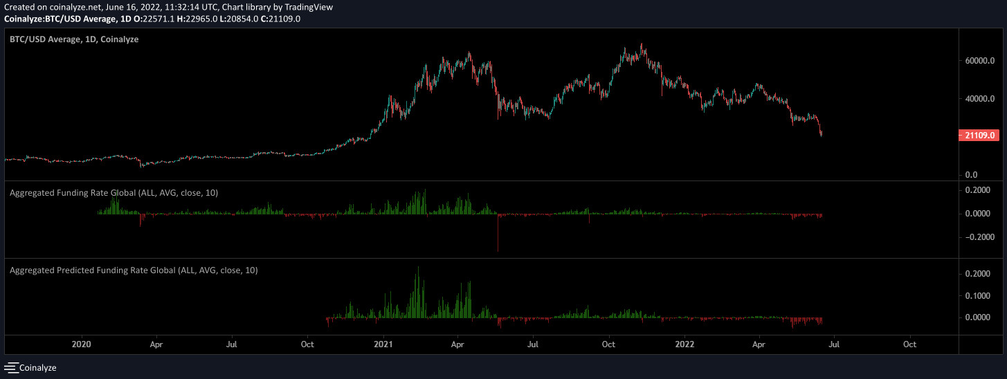
The market is heavy short at the moment. As you see you can see the funding rate is more negative compared to previous bottoms.
COT data

COT data is looking increasingly in favor of USD shorts. As EUR is the biggest part of the DXY (which is behind the USD symbol) we could see the DXY topping in the near future as long as smart money keeps building the eurusd long.
Dollar index
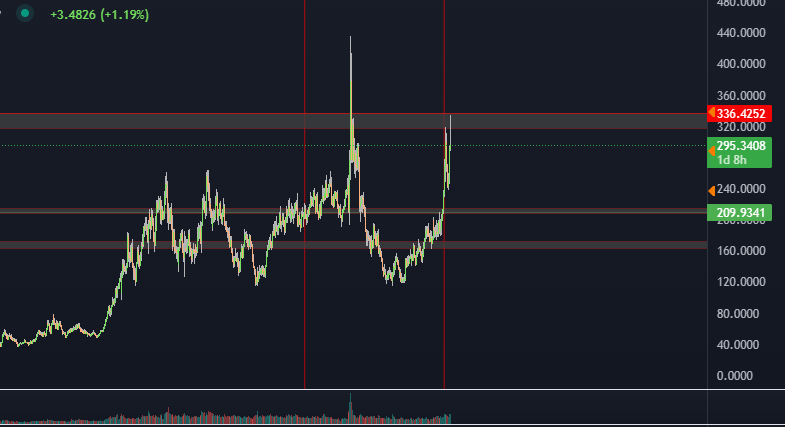
This equal weighted dollar index hit a big zone from 320-336. As discussed, a top in the DXY means a bottom in the bitcoin market.
Percent of supply last active
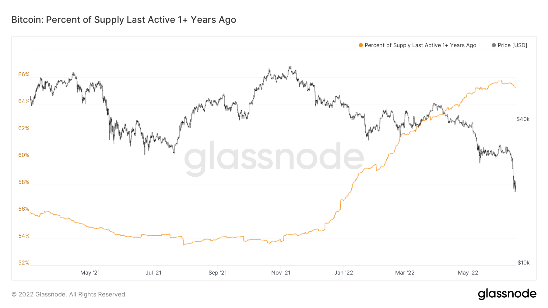
Percent of supply last active is rolling over again. Which (in history) always signaled the start of an uptrend.
Dormancy flow

Dormancy flow hitting buy zone levels.
Fractals / blueprints
LTCBTC and SILVERGOLD

As i’ve previously discussed. Crypto markets look for the most part the same as commodity charts, they only trade much faster.
As i’ve illustrated above you can see that the ltc/btc (left) and silver/gold (right) charts looks pretty much the same. The waves are the same. This strengthens my believe that ltc will keep trading like silver trades to gold. You can see that the silver/gold ratio is the blueprint for ltc/btc. Soon silver/gold wont have any future prices reference for ltc/btc, and ltc/btc will start acting as the blueprint for silver/gold.
LTCUSD and the 2012 Bitcoin bull market (what do they have in common?)

As you can see in the picture above, the ltcusd chart from 2017 till now and the 2012 bullmarket of bitcoin have a lot in common. The colored squares show in what phase I ltcusd potentially is in comparison to the btcusd chart of 2012.
Sugar and TRXUSD (and the timing of ZRXUSD)

As you can see in the chart above I made a comparison the sugarusd chart and trxusd. As I’ve talked about earlier commodities and crypto trade for the most part the same.
To make things more clear I’ve colored the market phases of sugar and trxusd. My believe is currently sugarusd will be trading a lot higher in 2023. This last blue market phase should be the final phase before trxusd continues its uptrend.
Below you see the zrxusd chart compared to sugarusd. The move of the first red arrow happened.

The Palladium and Ethereum prophecy

Palladium and Ethereum have a lot in common. They are both scarce, and the charts look the same if you put them both on the 3D chart. Until now all phases have been the same as you can see. This also indicates that this last move to the 1000$ range for Ethereum was the last shakeout. Which should be the start of a shortsqueeze to the all time high range later this year.
May the moon be ever in your favor.
Don’t forget to join Proton on Telegram: t.me/protonfund